
By Ahn Sung-mi
 |
| CFC founder and creative director Charry Jeon |
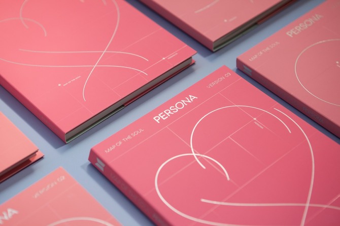
When BTS’ new EP, “Map of the Soul: Persona,” was released in April, many were curious about the meaning behind the pink album cover.

For Charry Jeon, founder and creative director at CFC, the Seoul-based design studio that orchestrated the visuals for BTS’ latest chart-topping album, the project was all about love.
“The ‘Persona’ album talks about love,” Jeon told The Korea Herald in a recent interview. “Intuitively, the color pink came into my mind, which expresses a pit-a-patting heart and excitement.”
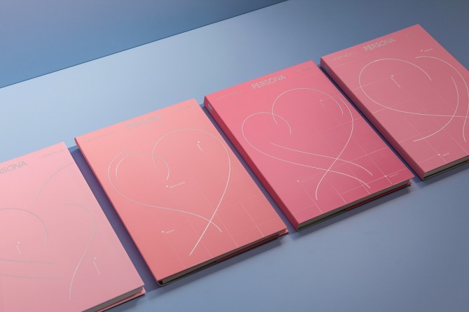
She used different shades of pink for four versions of the album cover.
“Just like there are various textures of love, I thought the variations of pink could portray the album’s mood better,” she said.
The central feature of the simple yet symbol-rich album cover is a heart, which captures the joy of love with graceful, flowing silver lines. The transparent, variable grid that appears in the background illustrates the “map” concept -- the central theme of the album -- with markers identifying the version and the album title on the map.
“With the map and heart, I tried to depict the trajectory of love,” she explained.
 |
| BTS’ “Map of the Soul: Persona” visual identity (CFC) |
 |
| BTS’ “Map of the Soul: Persona” visual identity (CFC) |
The fonts used on the album cover were all newly designed as well. The wordmark “Persona,” located in the center of the album, uses wavy letters to portray emotions that are stirred by the mood of love.
“We contemplated long on how to put together these themes in a simple form, while expressing BTS’ identity through this album.”
To do so, the designers at CFC listened to BTS music and watched music videos, visuals and clips to understand the band and its music style. “We all became fans,” she said.
“It was important to come up with design that was in accordance with BTS’ own identity,” she said. “There is a certain tone and manner that Big Hit Entertainment and BTS have kept throughout their music career and discography. The new album has to harmonize with the previous ones as well.”
 |
| BTS’ “Map of the Soul: Persona” visual identity (CFC) |
When asked how the designer perceived BTS’ identity, she said she thought it was the coexistence of cool and friendly. “As a world-class, very popular band, they can come across as being untouchable, but they are always very friendly and relatable at the same time.”
She admitted there had been pressure when she undertook this project because it was CFC’s first time designing an album cover, in addition to the pressure of having to meet such high expectations from a watchful public. But once the album was out, she was glad the agency, as well as many fans, liked the simple and elegant design.
 SHARE
SHARE


")
, Dongwan, Andy")


, Jun Hyun Moo")


As a graphic designer this is really interesting! I wish we could get this sort of insight more